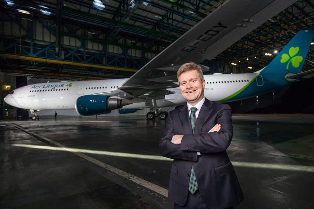
Sean Doyle, Aer Lingus Chief Executive. Pic: Naoise Culhane
The brand refresh is being rolled out across all brand platforms, with a new website design and new app design.
Aer Lingus today unveiled a refreshed brand with updated logo and new aircraft livery, reflecting the airline’s position as a modern and contemporary Irish brand that competes on the international stage.
The new logo restyles the iconic shamrock and is positioned multiple times across the aircraft. The first is within the new logo, the second sits on the tailfin, a third welcomes guests at the door, with a final shamrock on the wingtip designed to be in prime position for capturing on social media.
Sean Doyle, Chief Executive Officer, Aer Lingus said:
The refreshed brand reflects an airline that connects those living in Montreal to Marseilles; in Berlin to Boston; as well as those living in Cork to Croatia. The benefit for Ireland of being at the fulcrum of such connections is considerable and we in Aer Lingus are determined to realise this potential for Ireland.
Aer Lingus’ new look
The body of the new look Aer Lingus aircraft will be white with a teal-coloured tail and engines, bringing a sleek, contemporary feel to the design. The teal undercarriage means that Aer Lingus will be instantly recognisable to those on the ground.
The new look Aer Lingus brand will be introduced across the app, website, guest check in and boarding gates. All new aircraft will be delivered with the new livery.
Aer Lingus’ growth plans
The refresh is part of the airline’s ambitious growth plan which will see Aer Lingus increase its North Atlantic fleet from 17 to 30 aircraft by 2023. Overall, Aer Lingus plans to grow its A330 fleet to 16 aircraft (from 13 in 2017) and invest in 14 new A321LRs to provide capacity for growth across the Atlantic and within Europe.


